Blog
The use of Colors in Graphic and Web Design
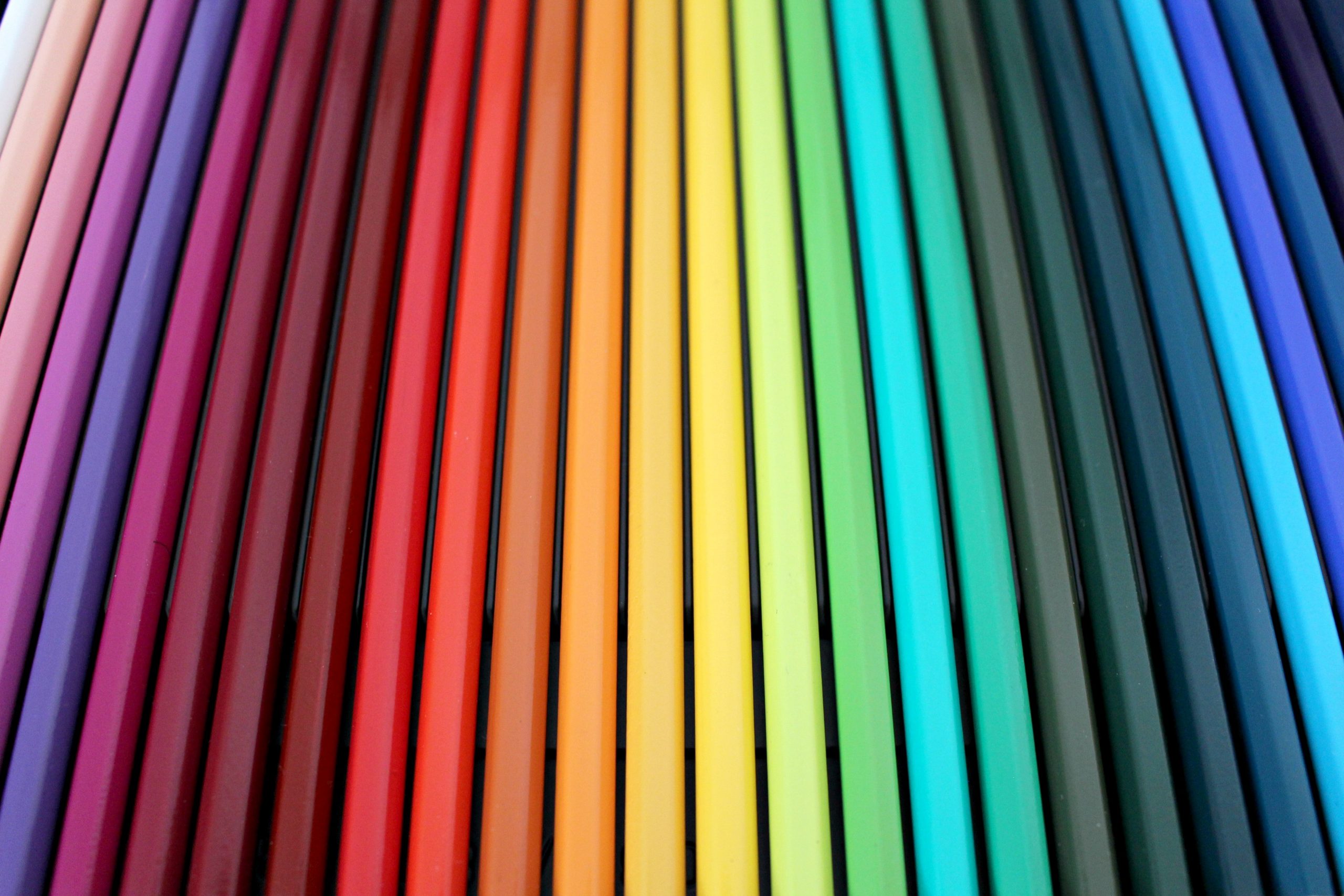
Who works with graphic design knows very well that colors are as important as the graphic itself. It is not a secret that colors are often associated with feelings and moods and the right choice of color is thus extremely important to characterize a graphic production. But what counts even more in a graphic composition is the right combination of colors.
The Color theory in design is indeed a science which goes beyond the taste of the single Artist. In this article we want to give:
- a brief summary of the base concepts you need to know regarding color theory, such as color models;
- the feelings that can be conveyed in the selection of colors and their use in social media;
- a list of common techniques you can apply to combine colors together in a fashion and harmonic way rather than basing your choices only on your intuitions;
- a list of websites that provides free color graphic design tools which can do the dirty job for you…
BASE COLORS MODELS
Basically, two are the models which provide color compositions and that you should know when approaching colors in graphic design:
- the Addictive model
- the Subtractive model
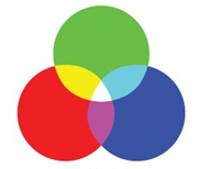
The Addictive color model is mainly used for digital media and digital combination of colors. This model is well known as RGB model, whose capital letters stand for the primary colors “Red, Green and Blue”, the bases of the model. Probably most of you Readers are already familiar with the RGB defifition since all screens are basically relying upon this model. As the name suggests, in this model the desired color is obtained by adding together other colors. Indeed, when primary RGB colors are mixed in the same proportions, the secondary colors are produced: cyan, magenta and yellow, as shown in the following picture. The use of light can correct final brightness of the combination.
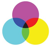
The Subtractive color model is the model generally used for printing and it works with a different concept: the different colors can be obtained by the subtraction of light. This model includes two different systems also known as RYB (capital letters for “Red, Yellow and Blue”) and as CMY (cyan, magenta, yellow). RYB is the oldest model, originally used in art, particularly in painting. The secondary colors, violet, orange, and green are formed by mixing equal amounts of red and blue, red and yellow, and blue and yellow. With the introduction of modern printing the RYB model has been substituted by the more effective CMY model (see the picture) adding the Black (known as the “key”) to the primary colors to better satisfy the requirement of inject printing. The black ink is beneficial in different ways: it covers imperfections of unwanted combinations in dark areas of the image, it improves sharpness and, last but not least, it reduces the consumption of the other more expensive colors if a picture needs to be printed only in black or grey.
It is worth remembering that the Addictive color model can reach a a wider spectrum of colors than the Subtractive color model . This is sometimes the reason why a digital image produced with RGB model may not exactly correspond to the printed image which uses the CMYB model. In order to avoid this inconvenience, the graphic designer shall previously adapt his production in accordance to the future needs of printing.
COLORS FEELINGS in DIGITAL MARKETING
Color is a very powerful instrument that you can use to influence the mood, to communicate a feeling and even to influence the psychological reactions of your the viewer, both when you are designing a logo or creating a web page for your site or your blog post. An inner meaning is often assigned to colors, which is connected to our subconscious’ reactions. Let’s try to summarize the effects that the principal colors generally induce in the people who look at them:
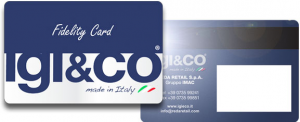
Blue: even though it sometimes may recall melancholic feelings, in social communication and marketing, blue conveys calmness, tranquility and reliability. The color is perfect when you want to send a message to your followers and your Clients connected with trust and fidelity. Do not fail to notice that most “fidelity cards” and “credit cards” choses the blue as their main theme. It is a choice of color more appropriate to already loyal Clients.

Red: it can create an opposite effect to the calm blue in your audience or in your Clients: red is a passionate color, warm and it moves strong emotions such as attention and speed. Since this color creates a sense of urgency, Companies most often use it to push the potential Clients to purchase their products as soon as possible. Indeed, this color is appropriate to capture and create an audience.
Pink: the color symbolizes youth, playfulness and tenderness, often associated with a feminine aspect. It can be also associated with childish feelings. Pink can also be the color of love but while red is passion, pink is the romantic side. Pink is sometimes combined in design with white to convey a sense of softness and charm.
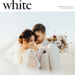
White: this color has been always connected with purity, innocence and peace. It is not an easy color to manage alone but it is very effective in combination with others to create contrast and to emphasize other items in the branding composition.

Black: it is a color that can evoke bad feelings, directing our mind to the darkness and obscurity. However in marketing is effectively used in combination with other colors, especially gold, to create a sense of luxury, exclusiveness as well as formality and seriousness. It is a very powerful marketing and social media instrument to capture the audience, working on the sense of “elite” attraction.

Green: the association with nature is obvious for this color. It is more and more chosen to highlight environmental awareness, clean and renewable energy. The color evokes feelings connected with calm and well-being as well as hope and friendship. Green reminds of permission and possibility (think about the traffic light!) and in that lays its power: marketers use it to convey the sense of the right choice and sustainability.

Yellow: the color conveys optimism and joy. In branding, yellow is identified as fun, energetic. Like other bright colors, yellow is very attention-grabbing, especially if used with another color in contrast. For all the mentioned reasons, yellow is many times proposed for a low cost or “quick and easy” branding approach.
Orange: the perfect color to transmit a funny, happy and entertaining message. Orange is usually seen as healthy, and it capture the attention of the Client. Orange reminds us of sunsets and autumn. The use of orange in digital marketing shall be wisely dosed to avoid diverting the focus from the desired message. Recently the selection of orange as main theme has increased significantly thanks to its capacity to attract without being as strong and aggressive as red.
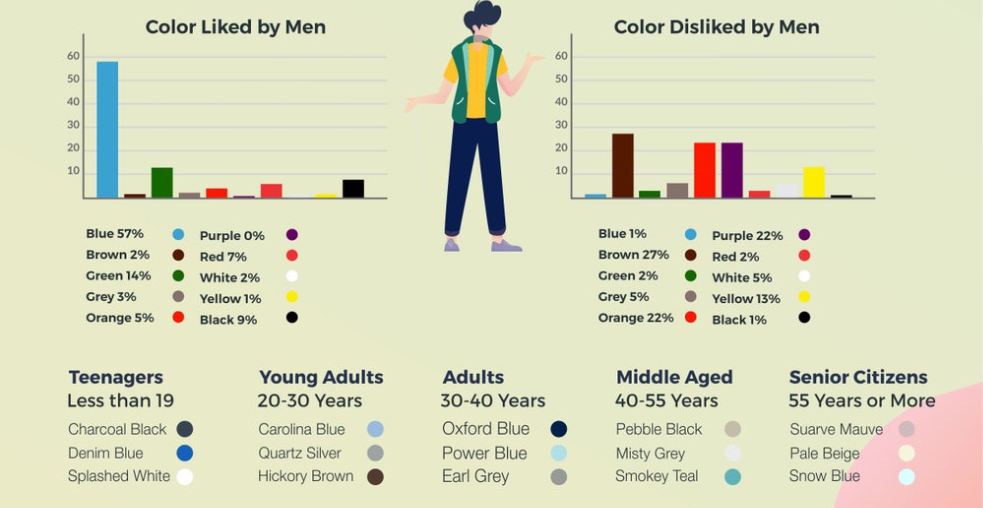
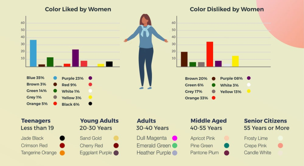
Source: entrepreneur.com
COLORS COMBINATION TECNIQUES AND COLORS SCHEMES
To effectively combine colors among them there are a few ”tricks” that can be followed in order to create harmony in the overall composition. The right combination of colors creates a sense of order which induces the viewer to feel at ease. On the contrary, if the colors you are looking at are not matching together, the sensation that something is wrong is perceived and it is our mind that sends subconsciously the message. Indeed, we can say that there is a scheme that is not coordinated and, although we may not exactly be aware of the cause, we have no doubt that something is out of place. Here below, we are presenting some simple schemes that you can use in your compositions that really work in design.
- MONOCHROMATIC COMPOSITION
In a monochromatic composition only one color is the base and it is combined with different shades or tints of itself in a way that appeals to the overall picture. The advantage of a monochromatic composition is that the darkness and lightness of the image can be varied without compromising the result. One of the drawback is that the contrast of the picture is minimal but that is the key to give a feeling of calmness and gentleness. Working with a monochromatic composition is not easy and we suggest to take the challenge only after you have experimented other color schemes. The monochromatic approach can be used in digital marketing to create a background too.

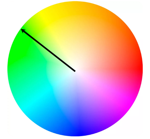
- ANALOGOUS COLORS COMPOSITION
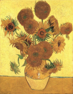
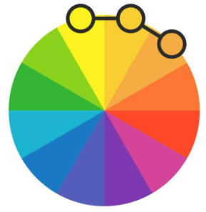
This composition is very simple and it only requires to select colors which are located next to each other on the color wheel. Again this combination creates a very low contrast and it can be selected as an alternative for your background production since it doesn’t distract the attention of the viewer from the message you want to pass. However, if wisely mastered, the use of this color composition can be the key to the production of masterpieces: the famous Vincent Van Gogh offered several examples where he effectively combined analogous colors in his paintings, see for instance the “Sunflowers”.
- COMPLEMENTARY COLORS COMPOSITION
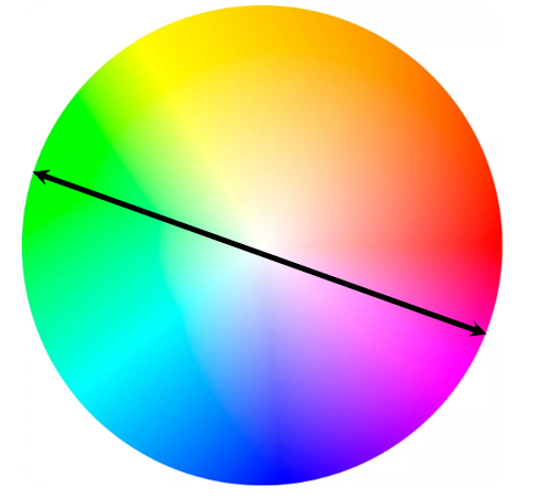
To create a complementary color composition you need to pick colors on the color wheels which are placed in front of each other. The effect is magic because the contrast is high but at the same time the harmony is respected. This principle is very easy to follow and very powerful at the same time. You can use this technique whenever you want to draw attention to a specific colored sentence using the complementary background, such for instance when you create a click button in a web site.
- SPLIT COMPLEMENTARY COLORS COMPOSITION
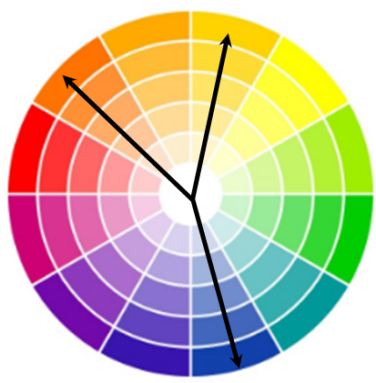
This combination uses almost the same principle as the previous one but it allows to pick three colors at a time. Once you have selected one color, the others are defined, being the two adjacent colors of the complementary color you have selected. Remind that he split complementary combination works also if the two other colors distance the same from the complementary to the color you have first selected, however, the closer they are, the more similar to the complementary combination will be the outcome. The advantage of this scheme is that it can be less aggressive than a standard complementary combination.

- TRIADIC COLORS COMPOSITION
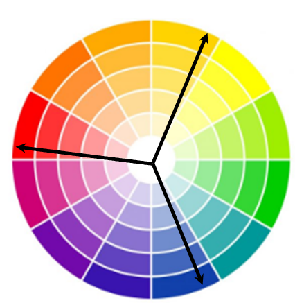
The secret at the base of this combination is to select three colors that are at the same distance between them on the color wheel. If you want to reach a design which is perfect for a child or extremely friendly, the triadic colors combination shall be dosed in equal portions. It is possible to tone down the triadic color scheme if one of the three colors is a dominant color and the other two are secondary colors.

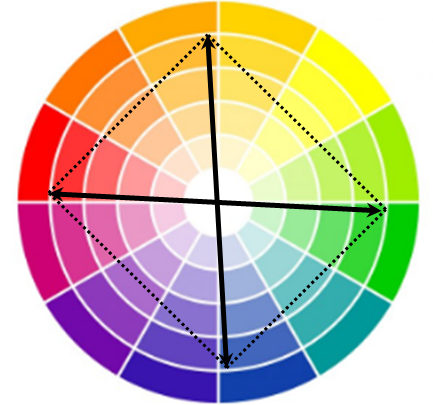
- TETRADIC COLORS COMPOSITION
A Tetradic colors composition is composed of two sets of complementary colors. Indeed it is also called double complementary scheme. It is the most difficult one to be implemented because the challange is to well balance the colors in order to give the right harmony, which is not always easy, especially in combining warm and cool colors. However, if wisely used, the final combination can lead to stunning and vibrant results and it leaves the design open to many different variations. It is sometimes better not to use the four picked colors in the same amount in your design to better harmonize the composition.

HOW TO CREATE HARMONY IN THE COLORS COMBINATION
Now that we understood how colors can be combine and which are the techniques to create colors schemes, we want to share a few tips to organize the steps to drive your final design by selecting the right colors combination.
SELECT THE FEELING
First of all you need to focus on the feeling you want to convey with your design. Select the main theme based on the specific color that can better represent that feeling, either you want to surprise the viewer with a bright color or to relax him . Find inspiration above in this article where the main massages connected to colors are described.
SELECT THE CONTRASTS
The second step is to choose the colors that better can create a contrast and focus the attention exactly where you want to direct the Viewers. If you are selecting multiple colors to create contrast, consider also that the contrast may be enhanced by the shapes assigned to each color, modifying the way we perceive it. To select the right color scheme and combination follow the color theories picking one of the combination we discussed before in this post.
USE THE 60 – 30 – 10 COMBO RULE
This rule can be considered the very base to start. The principle is very simple but effective at the same time. Imagine you have selected a triadic color composition for your design, which is the space dedicated to each of them? The 60-30-10- rule comes into your help, suggesting to dedicate the 60%of the available space dedicated to the firs color, the 30% to the second choice while the remaining color takes the rest, that is the 10% of the total palette. Often the color dedicated to the greatest percentage (60%) should be a neutral color but also the brand main color, the second one (30%) should be the his complementary or the secondary color of your brand, while the third (10%) can be the one which gives a vibrant touch to the composition.
BEST SITES FOR COLORS COMBINATION IN DESIGN
We have gone through all the important basic knowledge you need to acquire to create your perfect colored design. It is now time to have a look to what the web offers to help the Designers with colors picking and combinations. We have quickly reviewed and listed, in order by our preference, some of the websites that we ourself are used to visit to get support for our productions and that offer their services for free.
Position 1: COOLORS
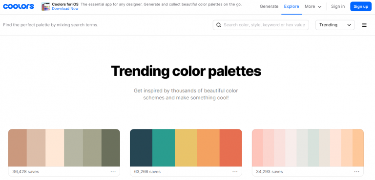
This website is absolutely fantastic and it is our first choice. Even the name of the site is “cool” but the services provided are so interesting and so user friendly for a graphic designer that they exceed the name by far. You can pick up existing palettes such as the most trending ones shown in their page, by clicking directly on each color and paste the color code right into your design software to use. Otherwise, you can generate your own palette simply by blocking the colors you like from the selection proposed automatically by the site each time you press on the space bar. In this way, one after the other you chose the color you need, getting a perfect harmonic combination with no effort at all. Fantastic! There are also a series of additional useful tools, such as the “contrast checker” which give you a rating based on the colors you picked and many others. Have a look by yourself and you will get addicted to this site!
Position 2: SCHEMECOLOR
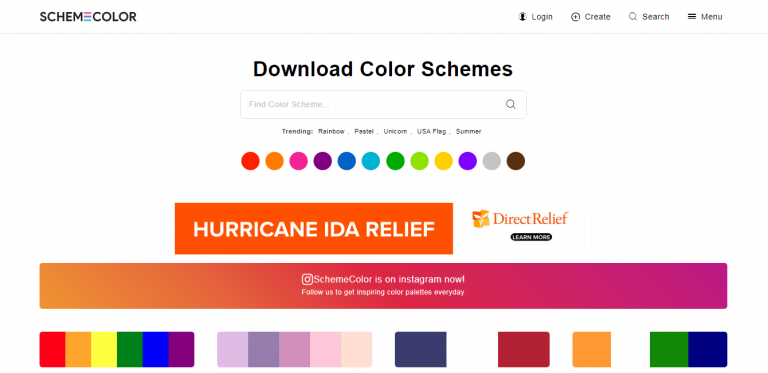
We also like this site very much because it not only supports the designer with palette generation tools but it provides a series of palettes grouped with a really smart classification, giving many suggestions regarding what you are searching for. It is also appreciated the use of images in presenting the palettes for some categories which allows to figure out on real cases the application of the selected colors. The site includes a blog which posts very interesting articles regarding color combinations in real life.
Position 3: COLORSWALL
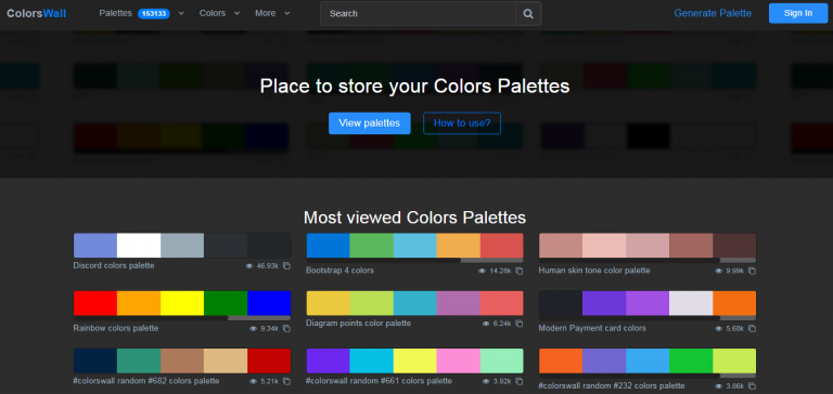
Another useful instrument to find inspiration with pre-existing palettes by selecting the topic you are interested in. You can find in this way prearranged palettes which fit with the theme. The color generation tool is, in our opinion, well done and useful to select the appropriate colors scheme combination. Interesting section is the one dedicated to the most used colors in the web, grouped by year and based on the presence in colorswall’s palette.
Position 4: COLOR-HEX
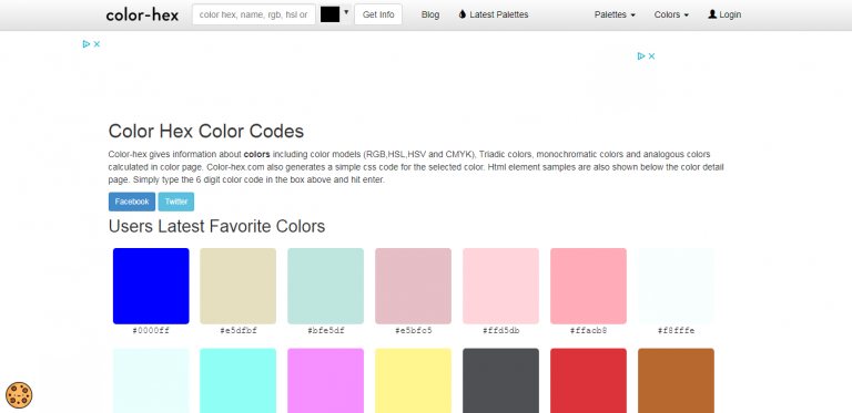
Color-hex provides all the needed information for every color you need. You can have a look to popular color palettes and to popular colors, discovering analogous, complementary colors and so. What we like of the site is that all the information of a specific color are contained in a single page and well organized.
