Blog
10 Best Design Books to read in 2021
In this article we would like to discuss about our personal ranking about books that can potentially have a great impact in the life of a graphic designer, a creative or a web developer. We are aware that choosing only ten books between many other important publication is not simple (and maybe not fair), considering also that different niches of graphic design are sometime tackle. However, we decided to write about our tastes to give you a suggestion in case not yet decided which would be your next book in the reading list.

Consider the classification only as a personal list which helped us to clarify our minds regarding our favorites books in the field. We hope you will enjoy it!!! Let’s start:
N1 : Designing Brand Identity: An Essential Guide for the Whole Branding Team
by Alina Wheeler
At n.1 Ydeograms suggests Designing Brand Identity by Alina Wheeler.
The latest revised edition is still a super bestseller and for many good reasons!
The content is well organized in 3 different sections, each with different purposes, that lead from the very beginning of the research process to the design and definition of the true brand identity.
The three sections of the book cover the following topics:

- Brand fundamentals: this part introduces the foundations and principles and it illustrates what makes the difference between a true identity of the brand and the sole brand
- Process basics: creating and implementing effective brand identity requires a specific and proved process related to decision making procedures
- Case studies: this section has been further implemented in the recent edition and it is in our opinion the core of the book because it offers all best practices that lead to successful well-known brands, concentrating on last digital market strategies and trends such the use of social networks and online instruments
In the book you can find:
- Over 100 branding subjects, checklists, tools, and diagrams.
- 50 case studies that describe goals, process, strategy, solution, and results.
- Over 700 illustrations of brand touchpoints.
- More than 400 quotes from branding experts, CEOs, and design gurus.
Designing Brand Identity is a comprehensive collection of the right instruments for branding success and example for your inspiration. It is well suited not only for brand managers, marketers, design teams but also for single freelancers who wants to bring their approach to a professional level.
In conclusion we really appreciate the book and we strongly recommend to have a copy in your library.
N.2 : Logo Modernism
by Jens Müller and R. Roger Remington
We found really difficult not to give this book the first place of our personal classification. It is indeed another masterpiece and a must have in your collection.
The size of the book and its weight do not make it a “portable” item but the dimensions (25.4 x 5.1 x 38.1 cm) suggest its importance and gives it the full right to gain a space in your bookshelf (if it fits…).
The introduction of the book gives an overview of the history of logo design as a preamble to the real content of the book which is a great instrument of inspiration for logo designers with about 6,000 logos ranging from 1940–1980.
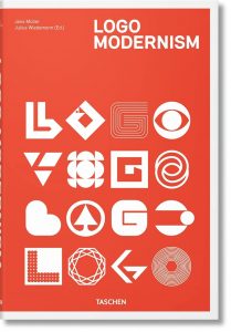
Most of the logos included are very simple with geometric forms, constructed out of primitive shapes like the circle, square or the triangle. The pages are mostly illustrated in black and white with some colored inserts used wisely in some specific areas.
The book is organized in three different sections:
- Geometric
- Effect
- Typographic
Each of these parts is then split into further sub-section, arranged by leading styles and forms (i.e. dots, squares, alphabet and so on).
The book also features eight case studies, detailing important projects such as Fiat, The Daiei Inc., and the Mexico Olympic Games of 1968.
Here some of the book’s features:
- Publisher: Taschen GmbH
- Language: English, French, German
- Dimensions: 25.4 x 5.1 x 38.1 cm
- Pages:432
- Weight: approx.:3.5kg
If you are interested in logo design this book is definitely your choice: the simplicity and elegance of presented logos are a clear explanation of why often “less is more”.
N.3 : The Elements of Typographic Style
by Robert Bringhurst
If you want to know everything you need about typography this is the right book for you. It doesn’t surprise that this book is sometimes known as the “Typographer’s Bible”.
The content of this book is supported by well-made illustrations and diagrams but what surprises most is the passion for details and the infinite knowledge that the Author is putting in the subject. It also helped in creating this fantastic writing that Bringhurst came to book design and typography from poetry: his prose is captivating too, relaxing, elegant and recognizable.
The book is not dedicated to web typography so do not expect that if you decide to buy a copy. However, the fundamental typographic rules have been the same for the last hundreds of years and the new digital area still requires to know and understand the basics of typography in order to be effective in communicating your massage, in marketing as well as in web developing. Therefore, it offers to the web Designer a solid ground in the principles of typography in order to select a font based on sensible rules that create good typography.
The book can be virtually divided into two macro-area:
- The first thematic area deals with the typographic rules and the theory
- The second thematic area concentrates on the analysis of a great number of fonts, from the related historical origin to the details of their graphics
In this book you can find suggestion and insight regarding:
- Rhythm and proportion of the text
- Typefaces and page formats analyses
- Collection of Analphabetic symbols
- Structural Forms
- Shaping and organizing the page
- Selecting and combining different types
Here some of the book’s features:
- Publisher: Hartley & Marks
- Language: English
- Dimensions: 13.46 x 2.29 x 23.11 cm
- Pages: 398
N.4 : Grid systems in graphic design
By Josef Muller-Brockmann
This book deals with an aspect of graphic and web design that is often not sufficiently weighted. A grid system is a rigid framework that can help the designer to organize a page in a consistent and logical way. It help to produce a well-structured and balanced design, it give a coherent system to the page layout.
Nowadays, most people is getting used to start from a blank digital page with only set margins. The concept of using “no grid” or to break the rules of a grid to create dynamic effects is leading to avoid structuring appropriately the page with a structured grid.

However, this book reveals the power of setting a grid which can apparently may seem a too rigid approach but it gives the opportunity to an extremely great number of solutions. The book guidance for the function and use for grid systems from 8 to 32 grid fields and it explains how they can be used for different types of projects. The content gives also some insight regarding t use of the three-dimensional grid. Exact directions for using all of the grid systems possible presented are given to the reader: examples are provided to work correctly on a conceptual level.
This book completes the concepts reported “The Elements of Typographic Style” by Robert Bringhurst in giving all essentially needed instruments regarding the secrets of typography, extremely useful for a web or graphic designer.
Here some of the book’s features:
- Publisher: Arthur Niggli
- Language: German, English
- Dimensions: 21.3 x 2 x 30 cm
- Pages: 176
N.5 : Thinking with type: A Critical Guide for Designers, Writers, Editors, & Students
By Ellen Lupton
“Thinking with type” is another excellent book on typography and visual communication which deals with all typography essentials, from typefaces and type families, from kerning to the use of grids.
The book explains in a well-organized matter and with examples the basic typesetting practices for both print and screen, clarifying how to apply them and what are the reasons beyond.
The content is structured to offer three main sections, plus an Appendix:
- Letter: this section introduces types with a short history, type classification, designing typefaces and screen fonts
- Grid: deals with some of the finer details like kerning, spacing and alignment and includes some simple type exercises
- Text: is related to the importance of grids in controlling and presenting type
Appendix: offers very quick course in the areas of editing and proofreading
The second edition includes new content regarding:
- Style sheets for print and the web
- The use of ornaments and caption
- Lining and non-lining numerals
- Use of small caps and enlarged capitals
- Mixing typefaces
- Font formats and font licensing
It is worth reminding that the Author created a dedicated website that recall the practical instruction illustrated in the book with a special section for teachers.
Ydeogram suggest this book because, in addition to its valuable content, it is finely illustrated: It can be considered a balance between an aesthetic “design” book and a more “heavy” typography book like Bringhurst’s The Elements of Typographic Style, rated n.3 in our personal classification.
Here some of the book’s features:
- Publisher: Princeton Architectural Press
- Language: English
- Dimensions: 17.78 x 1.52 x 21.59 cm
- Pages: 224
N.6: How to Be a Graphic Designer without Losing Your Soul
by Adrian Shaughnessy
The book is a very good guidance for new designers who wants to start a profession. Young professionals will find precious advices, both theoretical and practical, to start a new career .
You can find valuable words from an experienced professional who worked at Intro, a well-established London design studio, where he was co-founder. He writes for other colleagues with no experience who may find some answers to questions and doubts such as how to manage the creative process, which are the steps to successfully interpret a brief, how to relate to global trends that include social responsibility and the rise of digital culture.
The Author provides important information regarding how setting up, running, and promoting a design studio, how deal and communicate with Clients, underling the importance of values such as the cultural awareness, the communication and the integrity
The book also includes inspiring interviews with leading designers, including Jonathan Barnbrook, Sara De Bondt, Stephen Doyle, Ben Drury, Paul Sahre, Dmitri Siegel, Sophie Thomas, and Magnus Vol Mathiassen.
Here some of the book’s features:
- Publisher: Princeton Architectural Press
- Language: English
- Dimensions: 19.05 x 1.60 x 23.2 cm
- Pages: 176
N.7: Steal Like an Artist: 10 Things Nobody Told You About Being Creative
by Austin Kleon
The book presents to the reader a simple but deep approach to the behavior of the Artist. Kleon tries to explain that the fact that everything has already been created is not a bad thing but that shall be an infinite source of inspiration for the Artist. Embracing the work of others, elaborating and developing it can lead to the correct artistic path. The concept of “steel from others” shall not be intended as plagiarize or skim, rather study and transform creatively what has been already available, like a scientist bases his new discoveries on past knowledge and others’ theories. Kleon suggests that creative work builds on what came before, and thus nothing is completely original.

The content of the book takes its origin from a speech that the Author gave to a community college back in 2011 which was quite impressive and soon became viral. The points highlighted in the speech and elaborated in the book are the following:
- Steal like an artist.
- Don’t wait until you know who you are to get started.
- Write the book you want to read.
- Use your hands.
- Side projects and hobbies are important.
- The secret: do good work and share it with people.
- Geography is no longer our master.
- Be nice. (The world is a small town.)
- Be boring. (It’s the only way to get work done.)
- Creativity is subtraction.
Here some of the book’s features:
- Publisher: Workman Publishing
- Language: English
- Dimensions: 15.24 x 1.42 x 15.39 cm
- Pages: 160
N.8: The Design of Everyday Things
by Don Norman
This book helps the reader to understand what lays beyond a good or bad product design seen through the lenses of the final User. You will find a deep analysis why and in which manner some products satisfy customers while others only frustrate them.
Faulty and wrong design is the determined by the failure to understand a product by the User. Vice versa, intelligent design helps users to easily and intuitively use a new product without effort. A well-designed product basically teaches its users how to use it. Therefore, Designers can use the same intelligent principles to create great products, always consider human psychology in their creations.

Designer shall analyze the “root cause” of the problem to amend a bad design; it is not sufficient to tackle it from a superficial way, the good Designer shall understand deeply the reason why a bad User experience is generated. He should orientate his design playing with product constraints to help the user understand the product: if a limited of constrained choices is left to the User, that will accompany him to satisfy his needs.
One of the most important lessons given by Norman is that Design needs to be human-centered to be successful, especially in this technological era. To satisfy that a products require patience and cooperation between marketers and designers carefully planned not to push it on the market and at the same time of enough quality for the designer and sufficiently profitable for the marketers.
Although the key subject is more oriented on physical products, the book is very helpful to understand the logics and principles that leads to a pleasant User experience and are widely applicable to digital products and web design too. For this reason the book is recommended to the vast majority of Creative people and Designers.
Here some of the book’s features:
- Publisher: Basic Books
- Language: English
- Dimensions: 21.15 x 2.54 x 13.97 cm
- Pages: 368
N.9: How to (Revised and Expanded Edition)
by Michael Bierut
Michael Bierut is without any doubt, one of the most appreciated graphic designer of the recent decades. In “How to”, he created a monograph in which he reports all his experience going through a great number of projects developed for various major Clients such as the Brooklyn Academy of Music, the New York Times, the Yale School of Architecture, ranging from museums and universities to sports teams.
Beirut illustrate these projects from start to end, providing historic images, drawings, sketches and working models, going through discharged alternatives and proposals to the Clients, right to the completion of the project. In each single journey the Author discloses the secrets of his process: he doesn’t hide examples of work his clients didn’t like explaining the reasons for the rejections and the lessons learnt too.
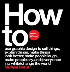
It is clear through the whole book that his work is eclectic his the career has been very prolific, revealing a love of clean, legible type solutions, an affinity for black-and-white solutions, and an ability to communicate the idea.
With this book, Bierut shares his design philosophy and way of approaching a project. This practical approach gives a great value to the book and makes it a “must have” for all artists, designers, students interested in how ideas, images, constraints and requests can be put together to satisfy the Client’s needs. The humility which characterizes the presentation of the Author’s work, despite being basically a Star in the Designers ‘world, is the touch that impresses in reading the book.
This revised and expanded edition includes more than three dozen projects. New projects have been added to enrich the text with other important Clients such as Mastercard, The Poetry Foundation, the International Center for Photography. Extremely interesting is the section dedicated to the presidential campaign of Hillary Clinton in 2016 for which Bierut undertook the brand design. The revised edition also brings some consideration on how the world has been changed by the pandemic from the point of view of the Designer activity.
Here some of the book’s features:
- Publisher: Harper Design
- Language: English
- Dimensions: 26.16 x 3.3 x 25.4 cm
- Pages: 352
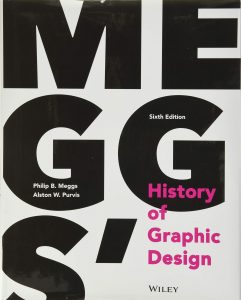
N.10: Meggs' History of Graphic Design
by Philip B. Meggs, Alston W. Purvis
If you are interested to deepen your knowledge in the history of design this is definitely the book for you. It starts introducing the origins of writing and alphabet and proceeding chronologically and geographically through the evolution of printing and type, it goes through the impact of industrial technology upon visual communications, giving insights on the different movements in the ages to the modern era, reaching the definition of the so called graphic design.
The book, now at his sixth edition, has reached more than 700 pages that give an idea of the massive effort by the Authors to summarize the history of graphic design. This new sixth edition has also been updated to focus on the digital age too, including:
- Latest developments in web, multimedia, and interactive design
- Overview of the Design in Asia and the Middle East
- New trends and technologies in design
- Timelines framed in a wider historical context to help in better understanding the evolution of contemporary graphic design
- Ancillary materials ( instructor’s manual, expanded image identification banks, flashcards, quizzes)
Illustrated with more 1,400 high-quality images, it can surely be considered a unique compendium of the trends, technologies, development and leading figures that have characterized the history of graphic design: highly recommended for your library!
Here some of the book’s features:
- Publisher: Wiley
- Language: English
- Dimensions: 26.16 x 3.3 x 25.4 cm
- Pages: 704
